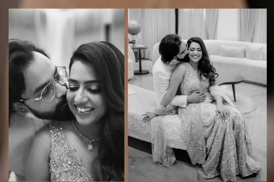
Design Invites That Show Off Your Personality With These Wedding Card Fonts
Picking the right wedding card fonts can help you create invitations that truly represent who you are! So, it’s time to find out how to select the right ones!

The great design relies on the cohesion of all its elements – the font, colour scheme, texture, angles - there’s just so much that can shift your design from one vibe to the next. Typography is one of the most important aspects of design, especially when you are looking to create a stunning wedding card. No matter what your aesthetic is, choosing the right wedding card fonts to affect a huge portion of the overall feel. With that in mind, let’s talk about different fonts and aesthetic styles, and how they can complement each other.
1. The Minimalist Aesthetic
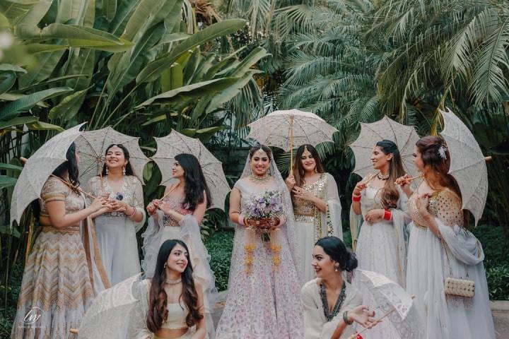
Minimalism is so in vogue right now. From interior design to graphic design and even curating Instagram feeds – this is a style that says a lot while relying on fewer elements. If you find yourself drawn to clean, minimalist designs, then the following wedding card fonts are apt for you:
- Althea – This is a serif font with clean lines, but with a twist. While many serif fonts have stiffer backers, this one has pronounced curves. This gives the font a less rigid feel. It is ideal for the main body of text as it is super legible.
- Magic regular – Calligraphy features often in minimalist designs. This is because everything else is so structured and neat that this design style offers a great break. This font is ideal for creating that break. Use it sparingly, though. Writing your names with it should be enough.
Ideally, you should not have more than two or three fonts per design as it can make the card look very cluttered and disorganised. If you want there to be differences between the headings and sub-headings, play around with the weight and transparency of the font. You can also play with letter spacing and size. This helps create a font variation that looks different, while still staying within the same family.
2. The Young and Playful Vibe
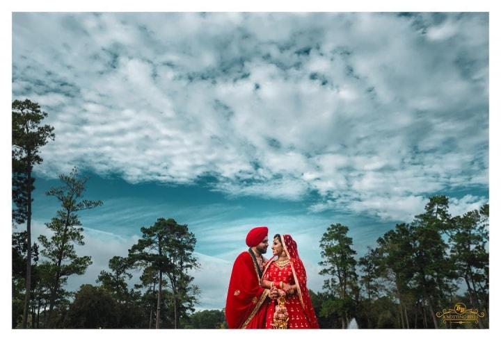
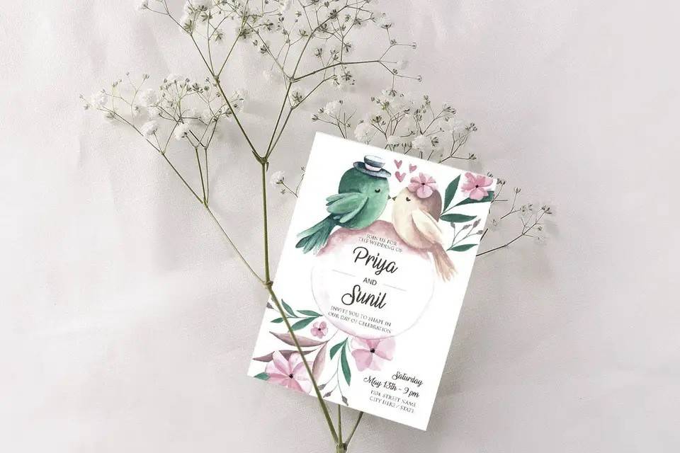
Most modern couples today love a playful vibe when designing their cards. After all, if a wedding is all about your relationship, then shouldn’t the card reflect that? If you want a young and playful vibe, choose fonts that are sans serif, and have a happy aura to them. For instance:
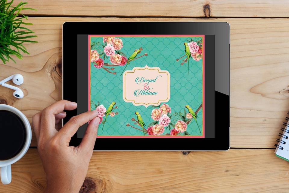
- Lemon Yellow: A font with all caps, Lemon Yellow is ideal for a handwritten, happy feel. You can use this font to write the main body of your invite. If you’re planning a social media invite or an e-vite, this font can work really well.
- Sweet Cookie: This font also has a handwritten feel. However, unlike Lemon Yellow, this one is entirely cursive. Thus, it offers a visual break from the previous font, while sticking to the fun theme. You should use this font for headlines.
3. The Traditional Vibe
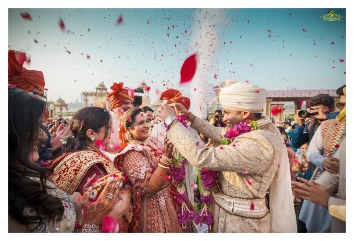
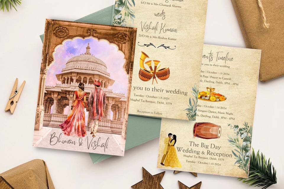
Sometimes, while going for the traditional Indian vibe, people get carried away using OTT loopy fonts. While there’s nothing wrong with curvy fonts, you must remember that a majority of your guests will be over 40. These fonts may be a bit hard to read for them. So, strike a balance between curvy fonts and legibility.
- Panettone: Panettone is a great font for headings and text that needs to pop out. It has the cursive feel of a loopy font, but the structure of a serif, which is a great combination for wedding cards. Use this font to highlight specific aspects of the function.
- Signatra: Signatra falls within the same aesthetic of a handwritten, loopy font so it matches well with Panettone. It runs a little italic, which offers a visual break. Moreover, you can use this font for the main body of the text that you want to put in the card.
4. Can you mix design aesthetics?
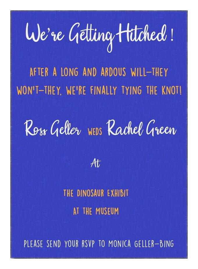
Image Courtesy: Kajoli Anand
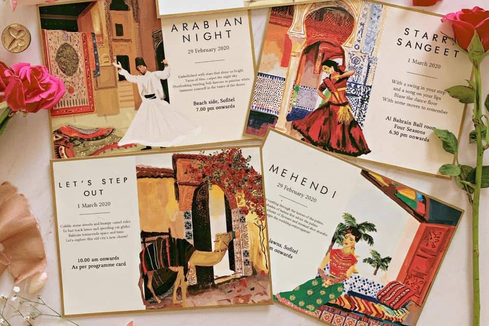
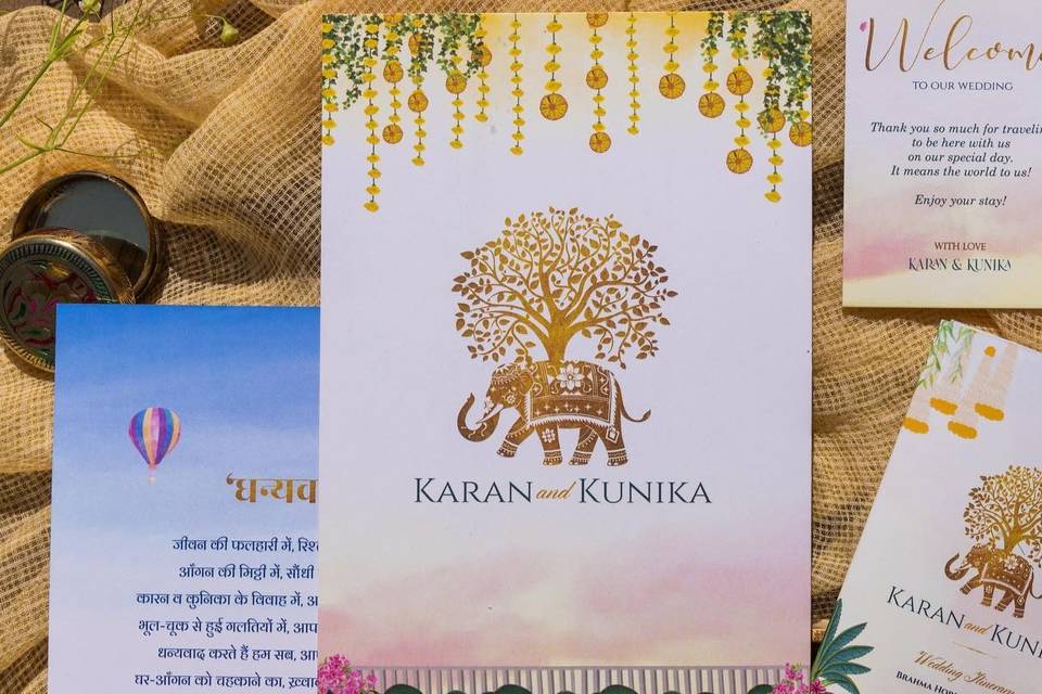
Yes, of course! For instance, if you love traditional Indian vibes and minimalism, you can choose a motif that is Indian but use it extremely sparingly to still have that less-is-more look. With wedding card fonts for hybrid styles, the key is to mix and match. You can also choose a very simple font and have the rest of the design elements speak for themselves. Finally, remember, colour also plays a huge role in affecting the mood of the font.
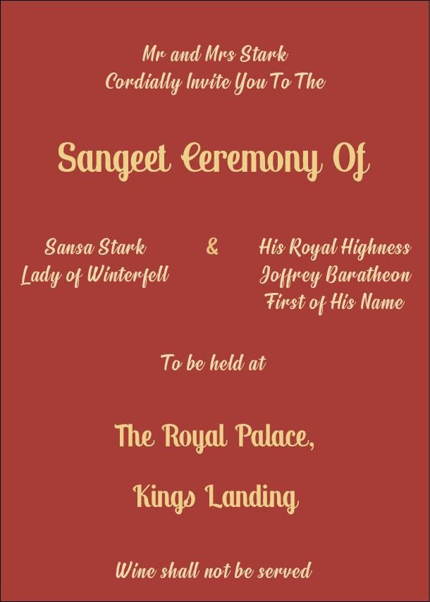
Image Courtesy: Kajoli Anand
While picking out your wedding card fonts, remember that design is very subjective. You may like something that another person may truly despise. So, do not take these rules as the gospel truth. Play around with the fonts that a wedding card printer may present to you to see what looks best. At the end of the day, it is your creativity that matters here. So, just have fun with it!
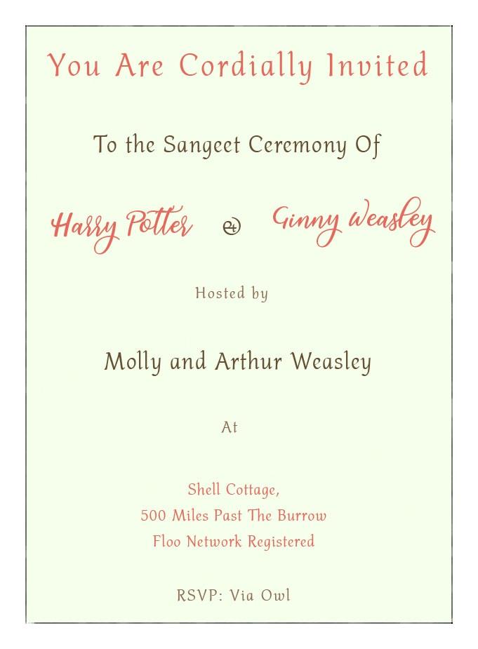
Image Courtesy: Kajoli Anand
If you’re not sure what to do, get in touch with our expert wedding card vendors by clicking here!

